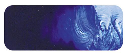
Ultramarine Blue | Matisse Acrylic Paint
Chemical Description: Sodium alumisonulphosilicate
Pigment Number: PB29
Lightfastness Rating: ASTM I
Pigment Opacity: Semi-transparent
Paint Opacity: Semi-transparent
Series 3

Ultramarine Blue | Matisse Acrylic Paint
A Renaissance Sensation
Ultramarine Blue, often hailed as the king of blues, holds a prestigious position in the artist's palette. It debuted in Europe during the Italian Renaissance, introduced as an exotic novelty by Arab traders. The colour, originating from Persia and spreading to India and China, was so rare and coveted that it was as expensive as gold. This scarcity made it a symbol of aristocracy, further elevating its allure.
Mysterious Origins and Ingenious Techniques
The exact origins of Ultramarine Blue were unknown to Italian artists, who only knew it arrived from overseas, hence its name, "the blue from overseas." In a fascinating twist, artists were often contractually obligated to use this pigment, leading to creative methods to extend its use. They would under-paint with azurite, a cheaper alternative, and glaze it with a thin layer of Ultramarine.
From Precious Gem to Accessible Pigment
The journey of Ultramarine Blue began with crushing lapis lazuli, a gemstone mined since ancient times. However, its use as a pigment only emerged after the decline of the Egyptian Blue. The breakthrough in Persian technology, involving chemical treatments, extracted a purer blue, albeit at a higher cost. This refined Ultramarine eventually made its way to Venice and Europe, maintaining its status as a luxury item for centuries.
The Dawn of Synthetic Ultramarine
The Industrial Revolution marked a turning point. The discovery of synthetic Ultramarine in the 1830s by Jean Baptiste Guimet, following a series of experiments, revolutionised its production and accessibility. Due to its light resistance, this innovation significantly reduced the cost, expanding its use beyond fine arts to industries like paper manufacturing, laundry products, textiles, cosmetics, and roofing materials.
Ultramarine Blue Today: A Versatile and Cherished Colour
In modern times, Ultramarine Blue, particularly the French Ultramarine variety preferred by artists for its violet tinge, is celebrated for its brightness and versatility. While some purists prefer the deeper hue of the original lapis-derived pigment, the synthetic version offers a broader spectrum of shades and applications. Matisse's Ultramarine Blue, embodying the characteristics of French Ultramarine, exemplifies this diversity.
An Essential Palette Companion
Ultramarine Blue's warmth and transparency make it indispensable in creating a wide range of colours. From sky blues to olive greens, its ability to mix with various pigments like Yellow Oxide or Rose Madder produces beautiful, lightfast shades. Its position on the violet end of the blue range offers unique opportunities for artists to explore nature's hues and craft dark tones that can elegantly replace black.
In conclusion, the evolution of Ultramarine Blue from a precious, exclusive pigment to a versatile, widely used colour reflects a fascinating history and its enduring significance in art and industry. Its journey from the depths of ancient
Ultramarine vs French Ultramarine
Exploring the Unique Shades of Blue In the realm of artistic expression, the choice between Ultramarine and French Ultramarine blue can significantly impact the mood and tone of your artwork. Ultramarine Blue, known for its deep, slightly more relaxed tone, is akin to the ocean's tranquil depths or the evening sky's vastness. It's a quintessential choice for artists seeking to imbue their work with calmness and depth. On the other hand, French Ultramarine, with its subtly redder undertone, offers a warmer and more vibrant alternative. This hue adds a dynamic and expressive quality to your palette, ideal for creating striking contrasts and lively compositions. Whether you're drawn to the serene elegance of Ultramarine Blue or the spirited vibrancy of French Ultramarine, each colour presents its narrative, enabling you to craft vivid landscapes, expressive portraits, or abstract masterpieces with distinct atmospheric qualities.
Safety Data Sheet for Matisse Ultramarine Blue (SDS)
To view or download a copy of Ultramarine Blue SDS, please CLICK HERE * (271kb)
*The above link will open an external Dropbox window
Ultramarine Blue is available in Matisse Structure

To install this Web App in your iPhone/iPad press ![]() and then Add to Home Screen.
and then Add to Home Screen.

